How to Choose Grout Color: The Small Design Detail That Makes a Big Difference
Let’s talk about grout.
That little line between your beautiful tiles is often one of the last decisions made during a remodel. The tile has been selected, the layout has been approved, and then suddenly the contractor asks:
“What grout color do you want?”
At that point, it can feel like a small decision. But grout is not just a filler. Grout is a design detail that affects the overall look, feel, and maintenance of your tile installation.
The right grout color can elevate your tile. The wrong grout color can distract from it, flatten the design, or make a beautiful installation feel slightly unfinished.
Grout Color Changes the Whole Tile Design
Grout can blend in, contrast, or become part of the overall pattern.
A grout color that closely matches the tile creates a softer, more seamless look. This is often a great choice for large-format tile, stone-look porcelain, or spaces where you want the tile design to feel calm and sophisticated.
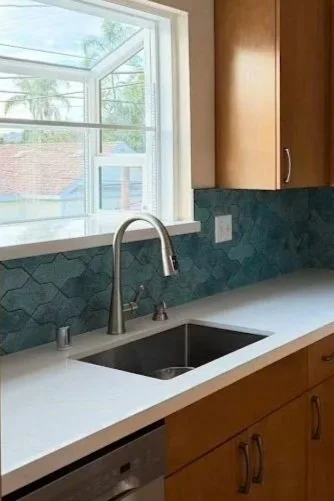
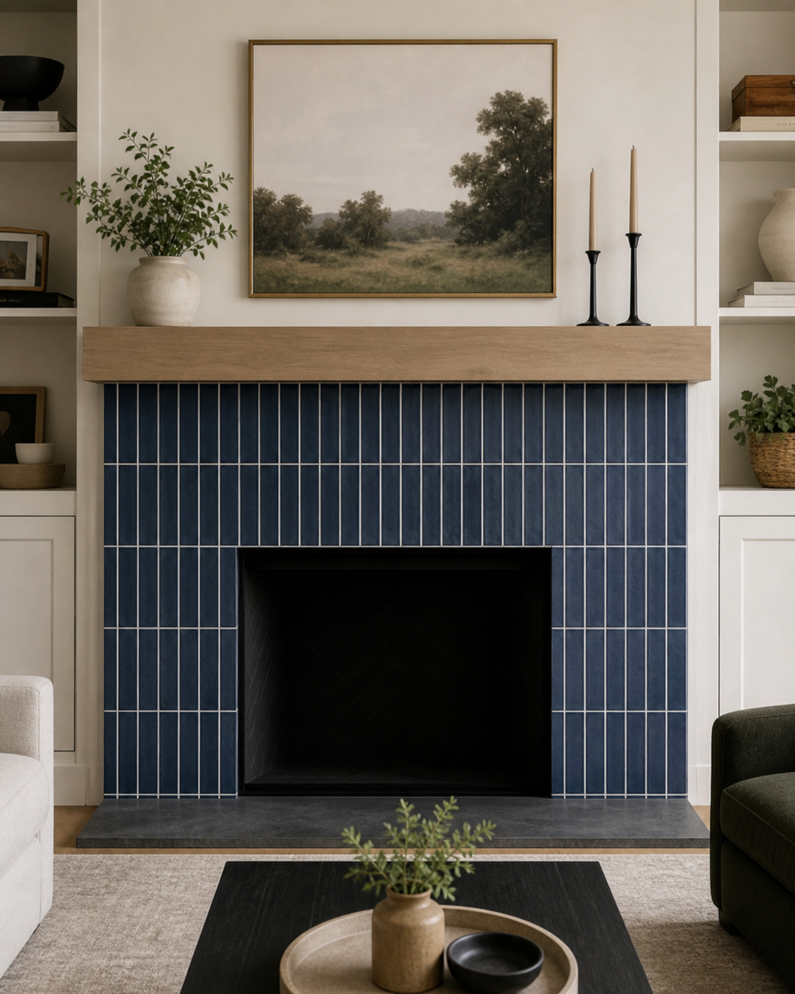
A contrasting grout color highlights the tile shape and layout. Think white subway tile with darker grout, handmade tile with visible grout lines, or mosaic tile where the pattern becomes part of the design.
A simple way to think about grout is to ask: do I want to highlight the tile shape, or do I want the grout to disappear?
If you want a quiet, seamless look, choose a grout color close to the tile color. If you want to emphasize the pattern, choose a grout color with more contrast. This can work beautifully with subway tile, checkerboard layouts, geometric patterns, mosaics, and handmade-style tile.
Neither option is right or wrong. The key is making the grout choice intentionally.
Grout Should Not Be an Afterthought
Grout is often selected at the end of the tile process, but ideally, it should be discussed earlier.
When choosing tile for a bathroom remodel, kitchen backsplash, entry flooring, or laundry room, grout color should be part of the overall design conversation. The tile shape, pattern, room style, and maintenance need all influence which grout color will work best.
Waiting until installation day can make the decision feel rushed. And urgent design decisions are where panic lives.
No one wants to be standing in a half-finished bathroom trying to choose between “snow white,” “bright white,” “warm white,” “frost,” and “avalanche” while a contractor is waiting for an answer.
That is not design. That is a hostage situation with color samples.
It may be a funny moment later, but in the middle of a remodel, it can feel stressful. Thinking through grout earlier helps the final tile installation feel more intentional and keeps the project moving with fewer last-minute decisions.
Color Is Not the Only Grout Decision
Color is usually the first thing people think about, but grout line thickness also affects the finished look.
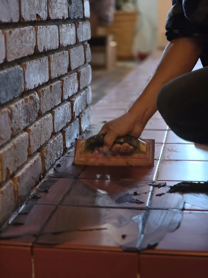
Every tile has a recommended grout joint size, and that recommendation matters. Tile type, edge finish, size variation, and installation pattern all play a role.
For example, handmade-style tiles (zillige look-a-like tiles) usually require a wider grout line because the edges are intentionally irregular. That variation is part of their charm, but the grout line helps the installation feel intentional instead of uneven.
Rectified tiles, on the other hand, have very straight, precise edges. They can often be installed with narrower grout lines, creating a cleaner and more modern look.
It may seem like a small technical detail, but grout line thickness can make a big visual difference.
Think About Maintenance
White grout can look beautiful, especially on day one. It feels fresh, crisp, and clean.
But on high-traffic floors, white grout can be difficult to maintain. Shoes, pets, kids, spills, and everyday life can quickly change that bright white grout into a much darker shade.
For busy areas like kitchens, entries, bathrooms, laundry rooms, and mudrooms, a more forgiving grout color is usually a better long-term choice. Soft grey, warm taupe, medium beige, or a color that relates closely to the tile can help the floor look cleaner over time.
Your future self will appreciate the practical choice.
Final Thought
Grout may be a small detail, but it affects the color, pattern, maintenance, and overall feeling of a tile installation.
A classic tile paired with a thoughtfully selected grout color can feel tailored, elevated, or playful. Grout can soften a busy pattern, create contrast, add depth, or bring out subtle undertones in the tile.
Before making a quick decision, take time to look at grout samples, consider the room, think about traffic and maintenance, and decide whether you want the grout to blend in or stand out.
When grout is selected well, it supports the tile and strengthens the entire design.
Ready to Make the Details Feel Easier?
At Impera Interior Design, we help homeowners in Poway, San Diego, and throughout Southern California make confident design decisions — from tile selections and grout colors to finish palettes, lighting, materials, and the details that make a space feel complete.
Thinking about a remodel or refresh? Reach out to Impera Interior Design. We would love to help you create a space that feels beautiful, functional, and uniquely yours.